
Verdigris
SAAS program providing overview of company energy use
*Note all images used in prototype are from Getty Images
The Project
They provide a SaaS subscription program that monitors building energy use with Adaptive Automation to predict and monitor in real time for Building Operators and Facility Managers to help facilitate in optimizing energy uses, reducing the carbon footprint that’s being released into the world, while also saving energy bills for their clients.
My role
UX Researcher, Product Designer
Project Team:
Bora Kim, Bethany White, RK Wiggins, Vince Tran
Timeline
3 weeks
Tools & Methods
User Research, User Interviews, User Flows, Affinity mapping, Competitive Analysis, Wireframing, Prototyping
the Challenge
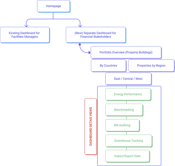
To create a whole new dashboard for financial stakeholders, or executives of companies they would like to sell their product and ultimately their service to.
“We've introduced a new capability that lets us automate some of the things that we've discovered, so that we can actually automate the savings for people.”
-CEO, Verdigris
01.
What is the business need and desire for an analytics dashboard?
02.
What is the idea they are trying to make into a user experience?
03.
How can we determine how it can be better defined for the user?
04.
Can we create a whole new dashboard for financial stakeholders to promote & sell their service to?
Understanding Customer Needs
Given the client proxies of what we could understand, we then found individuals to conduct our interviews with CFOs, Marketing Directors, Financial Directors, Business Dev. Managers
Understanding Business Needs
We also conducted interviews within the company to understand where the need for such a dashboard came about. We met with CEO, CFO, Marketing Technologist, and Business Development.
research

Affinity mapping
"We do look at subscription retention lifetime value, cost of acquisition and all those things.
-CFO (Banking)
If we're seeing a particular trend, we'll want to know where those trends are coming from and what is driving those particular trends.
-Director of Bus. Dev.
We want to be able to integrate it with other financial reporting or operating tools that people are using, I think is mostly Excel.
Managing Director
user persona

“The Money Manager needs a simplified way of visualizing the financial impact of their energy usage because they want to ensure they are making the most efficient use of funds and while confirming that they are contributing to the corporate responsibility of sustainability.”


-
Portfolio View
-
Benchmarking
-
Bill Audit
-
Greenhouse Tracking
-
Forecasting
-
Weather Normalization
-
Tariff Analysis
-
Import/Export Option
Competitive Analysis

-
Portfolio View
-
Benchmarking
-
Bill Audit
-
Greenhouse Tracking
-
Forecasting
-
Benchmarking
-
Bill Audit
-
Forecasting
User Flow
How does the Money Manager want to use this:
-
Wants to see Portfolio Performance (overall)
-
Is sustainability being met
-
Can they break it down to individual properties
-
What metrics do they need to visualize
-
How much is being spent, How can they see visualize energy performance, How can they analyze data - looking at history, to formulate forecasts.
-
Ideate & Design
-
Sketching out the flow
Usability Testing: Results
Insights & Reflections
-
We noticed that in this competitive analysis, every dashboard had different visuals of how much or how little information is being presented. Which suggested to us that there may not be a ‘common’ method in how information is being presented. It is ‘unique’ to each client as it looks to be customizable. After another round of research, we then started to think about our MVP and if we need to rethink our design strategy.
-
In presenting to our client of our findings, there appeared to be 2 alternative paths they could move forward with.
-
The first alternative is to continue with our design and conduct more usability tests to determine if our hypothesis was moving in the right direction. For the 2nd round of testing, find users who are in the hospitality industry who deal with multiple building portfolios and see if this product is something they would find valuable.
-
The second alternative the client expressed was to have their own internal discussion to determine if this product is necessary at all.
-