
tbd health
A mobile e-commerce site for STI at home test kits
*Note all images used in prototype are from Getty Images
The Project
TBD is an e-commerce website specializing with at-home STI kits with telemedicine consultation. Currently they only offer services within certain states - any individual who lives outside certain specified can not be treated.
My role
UX Designer
Timeline
4 weeks (solo)
Tools & Methods
Research analysis, create user journey maps and interior architecture, and develop hi-fidelity mockups for mobile design, website brand redesign
the Challenge
How to create an inviting website that creates a sense of comfort for a subject that can be seen as a taboo topic
STDs are culturally seen as a taboo topic. Usually associated with negative words as shame, many individuals are overcome with embarrassed which prevents many individuals from getting tested. How can we create a positive experience that promotes a women sexuality in a responsible manner?
01
Understanding Business Perspective
As it is a rebranding of their product site, I wanted to incorporate their core values into their website. It is important to understand the business needs, and how we can incorporate them into to the user journey
We are driven to create an experience that will change
how women think about their sexual health for good.
02
Site Evaluation
What does the current site look like at a glance?


03
So What's Wrong?
Accessibility
The existing colors fail accessability guidelines
Typography
There is inconsistency with type and scale
Consistency
Header, photos, and buttons all vary in design and scale
04
Users Response
50%
Beta testers have not registered an account
Without creating an account, the medical staff can't communicate test results and treatment options to patients
90%
Beta testers have not turned in their test kit to get tested
Without users not registering their main product it was difficult to measure success
05
Information Architecture

The interior architecture was split into 2 main components.
-
E-commerce sites that include landing product information, their mission statement and resources pages
-
Account pages that include tasks such as scheduling telemedicine consult, and purchasing the right STI kit with health assessment tests


Hello Alpha & Nurx
focus on service and medical as their from their landing pages
Competitive Analysis


Everlywell & Let'sgetchecked
focus on the products they sell at a first glance from their landing pages
06
User flow

07
Ideate & Design


-
A mood board was created in regards to how the founders identified their brand - from colors, people, and movies
-
From there created sketches of how the landing page and ecommerce pages would look like
-
Far right show initial design concepts of how the brand should look


-
Looking back at what the founders were inspired by and wanted to portray, I created a design system of colors, typography, as well as defining variants and icon styles


08
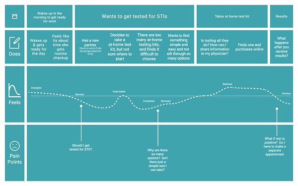
Identifying the User & Their Journey

Knowing who the product is used for
As much as their health is important, time is also valuable. If possible, they would like to access to best health care without having to compromise using so much of their valuable time running errands, traveling to and from clinics.
Mid-Fidelity Wireframes & Task Flows

09
Design Solutions
Set the focus on product on landing page
Their business identifies more with ecommerce aspect and aim toward creating direct relationships with other vendors.
Have user create account before purchasing product
To measure their success, directing the user to create an account before being able to purchase STI kit, greatly increases user functions

Take a health assessment quiz
Based on the user's answer, it would suggest what STI/STD kit would be best suited for the individual, enhancing the user experience

Schedule appointment for online care
User account would feature dashboard, incorporating an inbox that shows the results of each individual kit.
If a user should show positive result, they can schedule an online appointment with medical professional.

10
Insights & Reflections
-
In the next stages, I would love to be able to measure the rate of users creating accounts, as opposed to just browsing the website, as that was an initial problem.
-
It would also would help to gather more insight with further usability tests to see what aspects could work better and be improved upon.
-
I would also like to create the web/desktop version for the prototype as their current homepage and affiliated pages are not cohesive.
-
It was exciting to create concept and re-brand their website, a sex-positive space for women. Although they did move forward with a different designer for their final product, it was a welcoming creative challenge and hopefully one that I continue to improve upon future projects.